Anchorage businesses are asking a more specific question than they did a few years ago. It’s no longer just whether they need a website, but whether that website actually works on a phone.
If you’re searching for mobile-friendly web design in Anchorage, you’re likely seeing the same trend many local businesses see in their analytics. A majority of site traffic now comes from mobile devices. In some industries, that percentage is significantly higher. This shift has changed what effective web design looks like and how experienced agencies approach their work.
The difference between a site that looks fine on mobile and one that truly performs comes down to planning, structure, and usability.
In Short
- Mobile-friendly web design in Anchorage focuses on usability, speed, and clarity across phones and tablets.
- Agencies that specialize in mobile-first design plan content and structure around small screens from the start.
- This approach is best for established businesses ready to invest in a website that supports growth and conversion.
Why mobile-friendly design is now the baseline in Anchorage
Local search behavior has changed. Customers look up services while standing in a store, waiting for an appointment, or parked outside a business. They are usually trying to complete a task quickly. Responsive website design prioritizes access to information, ease of navigation, and performance rather than decorative layouts. Designers that take mobile seriously treat websites as tools first. This shift affects everything from sitemap structure to how copy is written and how calls to action are placed.
What mobile-friendly web design includes
“Mobile-friendly design” is often confused with responsive design. Responsiveness is expected, but it’s only the starting point. Designers that specialize in mobile-friendly design typically focus on:
- Navigation designed for thumb use rather than mouse clicks
- Text sized for readability without zooming
- Buttons and forms designed for touch accuracy
- Content hierarchy that places critical information first
- Pages optimized to load quickly on cellular connections
- Removal of horizontal scrolling
- Focus on page length (to avoid long scroll sites)
These decisions are made early, not added after the design is complete. When mobile use is addressed during planning, the site stays focused and easier to maintain.
Mobile-first versus desktop-first design
One of the biggest factors in how a website performs is how the layout is planned from the start.
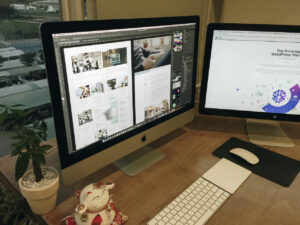
At Bianca Frank Design, layouts are set up to work across desktop, tablet, and phone — not just resized at the end. When we send the first homepage draft for review, we ask clients to look at it on all three. Seeing the site in real use helps catch spacing, hierarchy, and usability issues early, before the rest of the pages are built.
Mobile-first design means the phone layout is considered first, which helps clarify what content matters most and how people move through the site. From there, tablet and desktop layouts expand naturally without losing structure.
Desktop-first design can still work when handled carefully, but problems show up when mobile is treated as an afterthought. Crowded layouts, complicated menus, and slower load times are usually signs that mobile wasn’t part of the initial planning.
The goal isn’t choosing one screen size over another. It’s making sure the site works well everywhere people actually use it.
How Anchorage agencies handle mobile usability during development
Mobile usability is not just a design concern. It’s a development concern as well.
Agencies experienced in mobile-friendly web design Anchorage usually:
- Optimize image sizes and file formats
- Reduce unnecessary scripts and plugins
- Limit animations that affect performance
- Design forms with fewer required fields
- Test layouts on real phones and tablets
These steps are especially important for Anchorage businesses, where users may be accessing sites on slower networks or older devices. Performance plays a direct role in whether users stay on the site or leave.
Industries that rely heavily on mobile-friendly web design
Mobile usability affects every business, but some industries feel the impact immediately. Mobile-friendly web design is especially important for:
- Service-based businesses scheduling appointments
- Restaurants sharing menus, hours, and reservations
- Healthcare practices managing patient inquiries
- Nonprofits serving wide community audiences
- Professional firms relying on contact forms and calls
In these cases, poor mobile usability doesn’t just frustrate users. It directly reduces inquiries and conversions.
Mobile-friendly design and broader website strategy
Mobile usability works best when paired with a broader website strategy. Agencies that approach projects holistically often combine mobile-first design with Alaska website design services that include SEO planning, performance optimization, and long-term scalability.
Mobile-friendly decisions also support local seo services reach by improving page speed, engagement metrics, and overall user experience. Search engines evaluate mobile performance as part of ranking signals, especially for local search.
Clear mobile layouts also reinforce writing website content that is easier to scan, understand, and act on. Content written for mobile tends to be more direct and more effective overall.
Behind the scenes, mobile performance depends heavily on website hosting choices. Reliable hosting and ongoing web management ensure mobile load times stay consistent as content and traffic grow.
How to evaluate mobile-friendly web design agencies in Anchorage
Choosing the right agency requires more than reviewing screenshots. Mobile-friendly design should be tested directly. When comparing Anchorage agencies, view live projects on your phone. Pay attention to how quickly pages load and how easy it is to navigate, read, and complete basic actions.
Questions worth asking include:
- Is mobile design addressed during planning or after layout approval?
- How is mobile performance tested?
- What devices are used during quality assurance?
- Can you see live examples on real phones?
Agencies that specialize in mobile-friendly web design Anchorage can usually explain their process clearly and show working examples without hesitation.
Common questions
- Is mobile-friendly web design required for local SEO?
Mobile usability plays a significant role in search performance, particularly for local results, though it works best alongside a complete SEO strategy. - Does mobile-first design increase project cost?
Costs usually rise when mobile issues are addressed late. Agencies that plan mobile-first often work more efficiently. - Can an existing site be improved for mobile use?
Some sites can be adjusted, but older platforms often benefit more from a rebuild using modern standards. - How can I tell if my site is mobile-friendly?
Analytics, page speed tools, and real-device testing provide clear indicators of usability and performance.
Moving forward with mobile-friendly web design in Anchorage
Mobile-friendly web design in Anchorage is no longer a niche offering. It’s a core requirement for businesses that rely on online visibility and customer engagement.
The agencies that specialize in this work tend to emphasize planning, usability, and performance over trends. They build websites that feel simple to use because unnecessary friction has been removed.
If your current site feels slow, outdated, or difficult to use on a phone, starting with a website consultation can help identify where mobile usability, structure, and performance need improvement before investing in a redesign.